Sunday, 27 December 2009

25 and 26 Dec 09: Incandescent, fluorescent and halogen lighting

“Artificial Light in Photography


When photographers use artificial light in photography, the effect of the lighting depends on the type of bulb used. The warm dispersed glow of incandescent light produces an effect that is dramatically different from that produced by the sharp, narrow, focused beam of a street light.


Photographs taken with incandescent light often have a yellow tinge. A photographer can combat this tint in two ways. One method is to use a blue filter to offset the excessive yellowing. If you’re using a film camera instead of a digital one, you can use tungsten film that is designed for professional studio lights. Although it wasn’t intentionally designed with incandescent light in mind, tungsten film reduces the yellow tones so often found in indoor color photography.


Florescent lights produce a diffuse light that often translates into greenish tinges in color photography. Using a fluorescent or daytime filter helps remove this unappealing color.” (Source: www.photography.com/articles/basic-concepts/color-and-light/).

“A special type of incandescent lamp is the tungsten halogen lamp, in which a halogen is added to the filling gas, the gas is under high pressure and is contained within a small strengthened glass bulb.” (Source: www.ted.photographer.org.uk/photoscience_lighting.htm). This gives daylight balanced lighting (although it can sometimes have a blue tint).

The pictures on my blog of 14 Nov 09 demonstrate these different types of light. However, I wanted to demonstrate the different types of light by taking some images on location, capturing everyday life rather than staged shots. The results are shown below:

1. Incandescent lighting

These pictures are of my parents having their Christmas dinner. Due to my dad’s poor health they have just moved into a small bungalow with old fashioned but, thankfully, quite neutral decor. It was a bit of a squeeze in the small dining room which made it hard to find a suitable angle to take the photographs in order to capture the whole scene. In fact, it would have been easier to stage something in a larger room but after looking at the work of photographers such as Nick Waplington and Richard Billington in our art history classes I wanted to try out some ‘real life’ photography. It was also something of a challenge for me as I hardly ever take photographs with people in them and I thought these images might come out rather sad and unsympathetic but I think they are actually the opposite.

I have set out the images showing the original unedited versions which clearly have a yellow cast from the incandescent light followed by edited versions where I have adjusted the white balance to produce a more natural colour.


2. Fluorescent lighting

My first thought was to take some pictures at the local bus station but I found that, since it has been modernised, it no longer has flourescent lighting, nor does the train station I tried. Lots of shops still have fluorescent lighting but I knew I’d need to get permission from the store manager before I could set up and start taking pictures in a shop. I ended up at the stables where my horse Billy lives and where there is fluorescent lighting in the office and the lecture room. There were no events taking place this day so I had to stage some shots of someone at work (modelled by Ian my husband). You can see a greenish tinge on these pictures which I have then colour corrected.


And I just had to put in a picture of Billy (in natural daylight!).

3. Halogen lighting

Okay so as a a self-portrait this is staged, but it does reflect an everyday event - I never knew I looked so serious when putting my mascara on! As Halogen lighting is daylight balanced this shot didn’t need any editing.

I thought the lighting in my bathroom was really good and that the white sink unit would provide a good high key background for some product shots, so I had a play with my new macro lens to take some shots of everyday stuff in my bathroom. I think the lighting is very effective.


Thursday, 17 December 2009

16 Dec 09: Sara’s photo shoot

Sara Reid did a photo shoot with a model – Biomechanina – from Model Mayhem (www.modelmayhem.com/) and allowed me to sit in and see how she ran the shoot.

Sara built a set using some wallpaper she had brought specially, some props she brought from home and an old trunk she found in the studio.

Before the model arrived Sara tried out some lighting arrangements, using two fluorescent tubes and a top light

and then posed while I took some test shots for her – here is a sample of them:


Once the model arrived and Sara was happy with the lighting set up she started the shoot. The model was experienced so didn’t need a lot of direction. Sara took a number of shots from different angles and we also changed the lighting set up during the shoot – changing the location of the fluorescent tubes and shooting with different lights on or off. Here is Sara in action:


The model had a change of outfit and Sara added a top light from behind the set:


And here are some of Sara’s shots as posted to her Flickr account - www.flickr.com/photos/theskyfell/ :


Tuesday, 15 December 2009

15 Dec 09: Teasure

This was one of our weekly projects:

From the conquistadors seeking Eldorado, to Long John Silver in Robert Louis Stevenson’s Treasure Island to Indiana Jones, tales of adventurers seeking hidden treasure have long been a part of our culture. I wanted to capture this thought, so I made treasure map.
After drawing the map, I used an old wet tea bag to age it and then crumpled it up and left it to dry.  Finally I set fire to the edges.  The main light source was a coal fire - I staged the scene on the floor in front of the fireplace - additional light came from a small lamp in the corner of the room.  Post production I used the graduated filter in Lightroom to darken the corners and then adding a layer in Photoshop to 'posterize' the image.

Postscript: A few days later Andy showed me some other techniques which I could have used and which would have improved the image.  One of these was how to download and add a layer - we chose an old parchment style which Andy added and showed me how to blend using the opactity tool.  This gives the image a more aged effect as well as removing some of the oversaturated red colour:

Saturday, 12 December 2009

2 Dec 09: Reflective surfaces


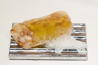
In the studio we'vedone some photos of glass bottles. Glass is one material which can be very reflective, creating interesting effects or sometime unwelcome glare. I wanted to try something different with a reflective surface so I took a chrome kitchen trivet which spelt out the word ‘Hot’ and placed it on an electric hob to reflect the light so that it not only said hot but it looked hot as well.
To shoot this I waited until it was dark and used the light from the hob as the only light source. The exposure was for 20 seconds at f/4.0 and an ISO of 400. I then adjusted the red saturation and hue in Lightroom2 to achieve a molten effect and used the spot removal tool to tidy up some spots in the background.

Wednesday, 2 December 2009

2 Dec 09: Studio lighting practice #4: objects

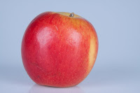
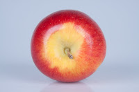
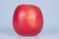
Working on my own in the studio, I wanted to complete the different lighting set ups required in my Systems and Processes assignment. Task one relates to the direction of light, with low key and high key backgrounds. I had completed some shots using one light set up at 45° (see blog from 20 Oct 09: Studio lighting practice #1) but wanted to complete the 45/45 lighting by using two lights to give really even lighting. I did low key and high key versions:


I love the way these make the apple look really “apple-y” – really showing the textures, blemishes and colours of the skin.

Task two required the use of modifiers. I had already tried using a honeycomb and a beauty dish (see blog from 21 Oct 09: Studio lighting practice #2). This time I was using an umbrella and a masked soft box.
1. Low key background with one light source (the lights on the right and underneath in this picture being switched off) with umbrella;


This produced a lot of flare on the right side of the bottle, which I think looks good on the glass but loses some of the detail on the label.  This kind of reflection this is not really considered to give a good image, the results are better when the lighting is more even...
2. So I tried using two light sources with umbrellas to give a more even distribution of light:

This look much better - a nice crisp image with very neutral background and no shadow.
3. Using a soft box with masking on just the left hand side of the bottle:

This gives a much duller background than using the umbrellas to reflect the light down evenly.  As there is only masking on one side (left) the bottle is much better defined on that side, with a nice sharp black edge.
4.With masking on both sides

This now has a nice sharp edge on both sides of the bottle, but by positioning the lights slightly differently I still acheived a shadow on one side.
5. For comparison I took the masking away completely:

This gives a much brighter image - there is not as much depth in the green colour - and although there are black lines on either side of the bottle the edges of the bottle do not appear as sharp and well defined. 
My favourite image is No 2. taken with two umbrellas.  The image is crisp and clear and the background is evenly lit so that the bottle stands out really clearly.

Unlike with the shots I took on 21 Oct, this time I did some post production using the crop and straighten tool in Lightroom to straighten up the bottle which looks much better.  The screen shot below shows where to select the tool on the right of the Develop screen and then the slider that can be used to rotate the image.  The grid over the image can be used to help align the object.

Monday, 30 November 2009

29 Nov 09: Shutter speeds

As my attempt to demonstrate the effect of using fast and slow shutter speeds taking pictures of horses (9 Nov 09: Shutter speeds/sodium lighting) didn't work out too well I decided to have another go but this time taking some photos of the traffic from a motorway bridge.  I went just as it was starting to go dark so that I would be able to use the effect of the car lights to really demonstrate the impact of using a slow shutter speed.
As seen below a fast shutter speed freezes the action
f/5.6 1/30sec
whilst the images below show the difference when using a long shutter speed to blur the action:
f/11 1/3sec
f36 1.0sec
f/36 2.0sec
f/36 4.0sec
I had also read about a technique taking a photo of a stationary object using a slow shutter speed and zooming in whilst the shutter is open to create a feeling of movement. So I decided to give this a try - the first picture was taken as a reference point and the second taken on a slow shutter speed (1.0 sec) whilst zooming in - the results are not quite what I was expecting - I got more of a ghosting effect than a feeling of movement.


Interesting though.

I subsequently found an article in What Digital Camera Magazine that explains how to do this: http://www.whatdigitalcamera.com/techniques/darkroom/photoshop/387157/create-a-zoom-burst.html. So its something I will be experimenting with in the near future.