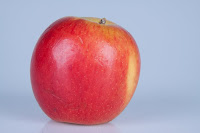
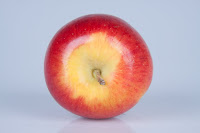
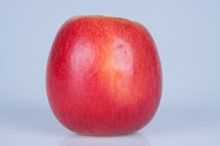
Working on my own in the studio, I wanted to complete the different lighting set ups required in my Systems and Processes assignment. Task one relates to the direction of light, with low key and high key backgrounds. I had completed some shots using one light set up at 45° (see blog from 20 Oct 09: Studio lighting practice #1) but wanted to complete the 45/45 lighting by using two lights to give really even lighting. I did low key and high key versions:


I love the way these make the apple look really “apple-y” – really showing the textures, blemishes and colours of the skin.
Task two required the use of modifiers. I had already tried using a honeycomb and a beauty dish (see blog from 21 Oct 09: Studio lighting practice #2). This time I was using an umbrella and a masked soft box.
1. Low key background with one light source (the lights on the right and underneath in this picture being switched off) with umbrella;
This produced a lot of flare on the right side of the bottle, which I think looks good on the glass but loses some of the detail on the label. This kind of reflection this is not really considered to give a good image, the results are better when the lighting is more even...
2. So I tried using two light sources with umbrellas to give a more even distribution of light:This look much better - a nice crisp image with very neutral background and no shadow.
3. Using a soft box with masking on just the left hand side of the bottle:This gives a much duller background than using the umbrellas to reflect the light down evenly. As there is only masking on one side (left) the bottle is much better defined on that side, with a nice sharp black edge.
4.With masking on both sidesThis now has a nice sharp edge on both sides of the bottle, but by positioning the lights slightly differently I still acheived a shadow on one side.
5. For comparison I took the masking away completely:
This gives a much brighter image - there is not as much depth in the green colour - and although there are black lines on either side of the bottle the edges of the bottle do not appear as sharp and well defined.
My favourite image is No 2. taken with two umbrellas. The image is crisp and clear and the background is evenly lit so that the bottle stands out really clearly.Unlike with the shots I took on 21 Oct, this time I did some post production using the crop and straighten tool in Lightroom to straighten up the bottle which looks much better. The screen shot below shows where to select the tool on the right of the Develop screen and then the slider that can be used to rotate the image. The grid over the image can be used to help align the object.


No comments:
Post a Comment