Fine art photography
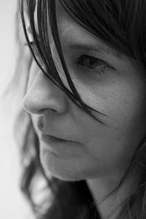
I think this image by Horst captures the essence of fine art portraiture beautifully:
Concepts and research
In order to explore this genre of portraiture I booked two studio sessions, together with a group of fellow students. We used the sessions to try out different types of lighting, for example, flash and continuous, soft boxes and beauty dishes, lighting from in front or behind, as well as using both high key and low key backgrounds. It also gave us opportunities to practice directing our subjects. Some of our ideas were based on lighting set ups in the book “Lighting for Portrait Photography” by Steve Bavister and some were influenced by research we had done into different photographers.
My main influence was Russell Wright and his Men of Arlington series (www.russell-wright.com/portfolio/project/menofarlington/index05.htm):
I like the way he captures the character of his subjects – the wrinkles and skin imperfections speak of the lives they have lived – but he manages to look deeper than the surface too - these faces have stories to tell . I also admire the way he uses lighting, creating areas of shadow which add to the character and atmosphere of the images.These images also capture the the same sort of feeling:
Picasso by Irving Penn
Homeless Irishman by Don McCullin
As I have been photographing objects and places over the last few months I have been developing style which focuses on close ups, picking out lines, patterns, shapes and textures, often producing abstract images of the everyday. I wanted to apply this approach to people in my studio sessions as well as taking some conventional portraits. These images by other photographers demonstrate what I mean:
Brassai by John Loengard
By Steve Pyke
Infanta Ralph Gibson
Outcomes
Session 1
Camera – Canon EOS 50DLens 18-200mm
Background - High key (on the curve)
Lighting - Flash
Models– Neil’s daughters Jess (8) and Rachel (16).
Example contact sheets:
There has been some initial editing to try different black and white conversions (low contrast, high contrast, grayscale) on some shots and some cropping on some images.
Selected images:
The first two were taken using a really simple lighting set up. We positioned one softbox directly in front of the subject, who was standing right on the curve, as inspired by page 65 of the book “Lighting for Portrait Photography":
The first two were taken using a really simple lighting set up. We positioned one softbox directly in front of the subject, who was standing right on the curve, as inspired by page 65 of the book “Lighting for Portrait Photography":
This created strong hightlight on the face but also a strong shadow behind Jess
32mm f/5.6 1/5 ISO100
to reduce the shadow we added a fill light from the left hand side:
32mm f/9.0 1/125 ISO100
Using the same lighting I took a close up of Rachel which shows how the softbox at the front highlights the face:
90mm f/5.6 1/125 ISO 100
For the next two images we raised the softbox on a boom, added a back light reflecting off the curve and positioned reflectors at either side of the subject. This was based on page 63 of "Lighting for Portrait Photography":
This created a high key background without any of the shadows we were getting in the first set up:
35mm f/16.0 1/3 ISO100
32mm f/9.0 1/125 ISO100
This was a bright fun session and the objective was to capture something of the girls personalities, which has been achieved. The images are in great contrast to those below which are darker in style and show a more pensive mood amongst the models.
Session 2
Camera – Canon EOS 50D
Lens 100mm f/2.8 macro lens
Backgrounds – Low key and high key
Lighting - Continuous
Models – Neil, Mark, George and Emma
Whilst Jess and Rachel are both gorgeous and very photogenic I am more interested in faces with character and that is what this shoot delivered.
Example contact sheets:
The contact sheets included examples in colour and black and white. The black and white images fit within the concept of capturing character and are more in the style I was looking for. So that's what I have focused on in the selection below. All were converted using the Lightroom black and white low contrast pre-set.
Neil
f/2.8 1/10sec ISO 100
Low key background. Single softbox at the front.
Emma

f/2.8 1/60sec ISO 100
High key background. Single softbox at the front.
Mark
f/2.8 1/20sec ISO 100
Low key background. Single softbox at the front.
George
f/2.8 1/60sec ISO 100
Low key background. Single softbox at the side (45°) with black reflector at the other side.
I decided to apply HDR to some of these images as I was interested to see how it would enhance the character of my subjects. When applied to portraits HDR can be far from flattering but on the right image it works really well to give an extra dimension. (I used the free trail version of Photomatix to produce the first of these two images hence the watermarking).
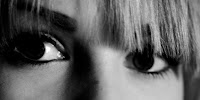
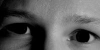
Of the images I took I found the close ups of eyes to be particularly effective:
and this is an area I decided to explore further.
Initially I tried taking some images outside the studio – these were taken under halogen spotlights
but the lighting is very harsh and they really stand out as being different to the studio work.
I then booked time in the studio and set up as shown below:
Canon EOS 50D
Lens EF 100mm f/2.8 macro lens
ISO 200
1/20 sec
With help from Neil I managed to get 25 people through the studio in this sitting. Each model was asked to sit in the same place and given the same directions in terms of where to look. It’s amazing how many different interpretations of “sit facing towards me and look straight at the camera” you can get!
With help from Neil I managed to get 25 people through the studio in this sitting. Each model was asked to sit in the same place and given the same directions in terms of where to look. It’s amazing how many different interpretations of “sit facing towards me and look straight at the camera” you can get!
After trying out a few different Lightroom edits on one image I selected a set of edits and applied the same treatment to all the images:
- Sharpen for portrait preset
- Black and white low contrast preset
- Contrast increased to +34
- Black clipping reduced
- Crop to 6x3
I then tweaked the contrast, brightness and black clipping on a few individual images.
Initially I used the dust spot removal tool to edit out any light reflections in the eyes. However, I felt this left them looking rather blank:


- Grayscale preset
-
- Crop to 6x3


No comments:
Post a Comment