Monday, 30 November 2009

29 Nov 09: Shutter speeds

As my attempt to demonstrate the effect of using fast and slow shutter speeds taking pictures of horses (9 Nov 09: Shutter speeds/sodium lighting) didn't work out too well I decided to have another go but this time taking some photos of the traffic from a motorway bridge.  I went just as it was starting to go dark so that I would be able to use the effect of the car lights to really demonstrate the impact of using a slow shutter speed.
As seen below a fast shutter speed freezes the action
f/5.6 1/30sec
whilst the images below show the difference when using a long shutter speed to blur the action:
f/11 1/3sec
f36 1.0sec
f/36 2.0sec
f/36 4.0sec
I had also read about a technique taking a photo of a stationary object using a slow shutter speed and zooming in whilst the shutter is open to create a feeling of movement. So I decided to give this a try - the first picture was taken as a reference point and the second taken on a slow shutter speed (1.0 sec) whilst zooming in - the results are not quite what I was expecting - I got more of a ghosting effect than a feeling of movement.


Interesting though.

I subsequently found an article in What Digital Camera Magazine that explains how to do this: http://www.whatdigitalcamera.com/techniques/darkroom/photoshop/387157/create-a-zoom-burst.html. So its something I will be experimenting with in the near future.

28 Nov 09: A Warhol pastiche

For our first portfolio we are required to produce an image of a commercial product.  One of the most iconic images of a commercial product is Warhol's silkscreen print of Campbell's soup.  During his career Warhol produced a variety of images of Campbell's soup ranging from a single can

to 32 cans (one of each flavour that was made at the time).


I decided to produce a pastiche of Warhol's soup tins by using a can of Campbell's but adding a carton of fresh soup as the up to date equivalent.  When I went shopping it transpired that the original Campbell's soup could no longer be obtained and a little research revealed that  following the 2006 takeover of Campbell's UK by Premier Foods the soup was rebranded as Batchelors (see article in the Daily Mail www.dailymail.co.uk/news/article-485107/Iconic-Campbells-Condensed-Soup-disappear-British-shelves.html) and the iconic can of soup is no more.  So I used the Batchelors soup instead.

To make the image I started by photographing both soups in the studio on a product table.  I used a high key background with backlighting to produce a sharp image on a very white background with little shadow.


I then used Photoshop CS4 to stitch the images together. I felt that the result was too crisp so I used the adjustment brush in Lightroom2 to blur the edges of the tin/carton and make the background less pristine and then added a layer in Photoshop to give a slightly aged effect. Here is the final result:


Notes:

Pastiche: musical or other medley made up from various sources; literary or other work imitating style of author, period etc. 
More information about Warhol's images of soup cans can be found at http://en.wikipedia.org/wiki/Campbell's_Soup_Cans

Postscript: Andy later showed me some other techniques in Photoshop for editing the images including how to remove the lens distortion and adding a layer to posterize the image giving it a Pop Art look in a different way to the one I chose.  He just worked on a single can:


25 Nov 09: Group Task - From capture to print

(Graphics by Helen)
Our group task was to use the skills we have learnt in lectures and workshops to produce a photograph influenced by one film from a selection of 11 titles. We started by looking up some of the films on the website IMDB (http://www.imdb.com/). Initially we looked at “Breakfast at Tiffany’s” but felt that in the time available we would not be able to recreate the glamour of the movie. Then we looked at “Dead Man’s Shoes” and “Into the Wild” before deciding upon “Rear Window”, in which a wheelchair bound photographer spies on his neighbours from his apartment window and becomes convinced one of them has committed murder.
We selected this because we liked the idea of taking an image of the photographer observing his neighbours. In her book “On Photography” Susan Sontag discusses the idea of the photographer as voyeur and Geoff Dyer, in “The Ongoing Moment”, discusses the idea of the photographer as observer represented by a figure in his/her photographs. I find both of these ideas really interesting and they seemed to tie in with theme of the movie.
We decided to recreate a still image from the movie trailer which was also used on one of the posters for the film:

We also planned to add some ‘bloody footprints’ to the image to pick up on the line from the film “what do you need, bloody footsteps leading up to the door?”
We went outside to find a suitable location. We wanted a location where the light would be coming only from a door behind our character, played by Mark. Initially we went to St Joseph’s club, but despite being given permission to go in and take some shots we left empty handed as the staff wanted to lock up and leave before we had even had time to set up properly. We then headed for the Victoria Centre. On the way we stopped to make some wet footprints on the paving flags and photographed them so that we could use layers in Photoshop to merge the two images together.

In the Victoria Centre we found the perfect location, a locker room where we could turn the lights off, Mark could sit with his back to the door and the scene could be lit by light from the corridor behind.

Having obtained the shots we wanted we headed back to the computer room to manipulate the images in Lightroom and Photoshop. However, having overlaid the footprints onto the main image we decided to leave them out as it made the cropped image too busy. We tried several different crops before choosing a final version which mirrored the poster image reasonably well and gave the effect we wanted. Having cropped the image down it became apparent that the image was not as sharply focussed as we would have liked. This was due to a small amount of camera shake as we did not use a remote shutter release. After trying several adjustments to make the image darker and moodier, we settled on adding a red graduated filter to the top left corner. The overall effect is to draw focus to mark’s eyes whilst the background colour provides a sinister atmosphere of paranoia and fear.  Despite the image not being as sharp as it could have been, when we saw the final printed version we were pleased with the final result which did capture the suspense of the movie:

Thursday, 26 November 2009

19 Nov 09: Drop focus and shallow depth of field

In our studio session yesterday, Andy demonstrated how shooting across an object, using a macro lens, could produce a very shallow depth of field and a narrow band of focus (known as drop focus). Here are some images I took to practice achieving these effects.


This first image of a metal grill was taken straight on using a 50mm macro lens:

I then took a picture of the same object but shooting across to produce a very shallow depth of field with a narrow band of focus across the middle – a really interesting effect:

Here are some more images of a variety of objects which each demonstrate one or both of these effects:


18 Nov 09: Software #5: Working with layers and layer adjustments – an introduction

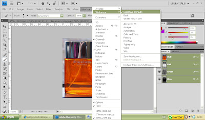
After opening the image you want to work on, you can reset the standard palettes on the right hand side of the screen by selecting “Window”, “Workspace”, “Essentials”:

This will bring up the layers panel:

Shortcuts to change the look of the screen are:
•  “F” changes the background colour from grey to black. (A grey neutral background is good for assessing images)


•  “Z” turns the zoom tool on and off
•  Holding the space bar then clicking on the image allows you to position the image on the screen

To minimise the palettes use the >> key:

The required palette can then be dragged out and expanded using the << key:

In the layers palette the symbols have the following meanings (see numbered screen print below):
1. The eye symbol indicates that the layer is visible, there is a thumbnail which previews the layer and the title of the layer is shown (the title can be changed by clicking on it).
2. The padlock indicates that the layer is locked and cannot be changed. The background layer is always locked. Other layers can be locked if required (see below).
3. The trash can – layers can be dragged and dropped in here to delete them.
4. The new layer symbol – a layer can be duplicated by dragging and dropping it here
5. The group folder – layers can be grouped into sections for ease of working by dragging and dropping the required layers into the group folder which can then be named. This is useful if working with lots of layers.
6. The fill layer – this can be used to adjust the background layer.
7. 8,9 and 10 – lock the pixels, position or all of the layer so that it can’t be changed accidentally:

From the tool bar selecting “Image”, “Adjustments”, “Levels” brings up a histogram which can be used to adjust the exposure levels using presets or your own settings:


Also on the “Image”, “Adjustments” menu are lots of other options such as the option to change the image to black and white. Many of the adjustments have an opacity tool for fading in and out the level of adjustment.

Also on the right hand palettes is the layer adjustment palette, which has buttons allowing adjustments to:
Brightness
Levels
Curves
Exposure
Vibrance
Hues/saturation
Colour balance
Filters
Posterize
etc

 Layer styles can be changed to give various different effects such as darkening, lightening, vivid light (shown below) etc

Layers can also be flattened – this is like stacking a deck of cards in that you can only see the front card and the others are all hidden behind. In effect it tidies up all your layers once you have finished working on the image.

18 Nov 09: Studio # 6: Macro photography

In the studio today Andy demonstrated the effects of using macro extension tubes. You can get extension tubes in various sizes to extend the range of focusing. As well as using them individually you can use them in combination eg 20mmm + 35mm will give 50mm. Unlike when you use a macro lens which does not lose light you lose one stop of light for each extension and have to adjust for this by opening up the f stop or the shutter to let more light in.

When shooting macro it’s possible to get a very shallow depth of field. To get a deeper depth of field it is necessary to shut the f stop down, maybe by as much as 6 stops, but then a slow shutter speed is needed. Therefore, it’s often necessary to use a tripod for macro photography.

Andy took some demo shots starting with a 50mm lens and then adding extension rings – 12mm, 20mm, 35mm and 50mm –


Photographing an object from above will give a deeper depth of field and show more of the object in detail, whilst photographing across the object will give shallow depth of field.


The shallow depth of field can be used to obtain a very narrow band of focus - a creative effect known as “drop focus”.

We were then provided with a macro lens so that we could try out some of our shots.  These are a selection of images taken by my group: